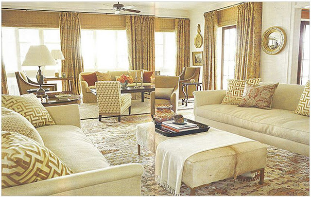
Design by Suzanne Kasler
I loved this room. The Walter Knabe wallpapered ceiling, the heavy orange velvet curtains ... the perfect color of orange, too - as if Hermes started making curtains! The fabric is actually from the UK fabric house of Holland & Sherry The framed antique maps, the modern art juxtaposing the fine french gilded furniture.
Another shot that gives you a better picture of the French chair, and the tapestry ribbon pillow.
Suzanne did a wonderful job in this gallery styled hallway - but since I don't have a room that even remotely can be styled this way ... I always just looked at the photo longingly but passed by it without thinking much about it. Til' today!
I've got so many back issues of magazines ... I'm ashamed to admit it. Today, I tripped over a pile, with this one on the top. Of course, since I nearly broke my foot - I figured I might as well take a look. Near the back, I ran across this - something I likely missed before:
Via Veranda Magazine May-June 2009; Photography by Thibault Jeanson
Instantly, I remembered the room ... but the pages that followed were all new to me ...
I think I swooned. Rich colors and textures, graphic Clarence House patterns mixed with traditional Rose Tarlow Melrose House frames ... that raw hair-on cowhide ottoman.
Orange is used throughout the home, as a primary color in the pattern on the curtains in the living and family rooms:
via Spitzmiller and Norris Inc. facebook page
the chairs and walls in the dining room ...
Notice that gorgeous tapestry in the background? Well ...
It also shows the dining room ... the chairs are quite different here than the ones we see in the magazine. Smaller, French in shape ... I think the custom leather chairs we see in Veranda are far better.
The architect photos show the kitchen styled ...
And although I find sinks like this to be highly impractical - and would never suggest any of my clients install one this way ... the photo is nice - and I do love a lamp on the counter!
This wasn't the only kitchen in the house though. The owners had the architects build a second kitchen in the guest house:
Much more serviceable this way IMO. I also love the center table which can act as an island or impromptu dining room table. Back in the main house:
The master bedroom is just like the rest of the house - soft and serene, with a pinch of trendy. I particularly liked the hallway that Kasler used as an office:
Seeing this entire house together just makes me want to rip the walls down here and start all over ... or better yet, find something more in keeping with the architecture of this house:
Course, I'm likely not going to find something similar around here. Porches like this are few and far between. Perhaps if I had $4,000,000 I could have bought this one! I found out that the house sold in April 2010. After the article was published in Veranda the previous May, the house was listed for sale in August 2009, Not unusual for high-end homes like this. It's also not unusual for clients to have loyalty to their designer - and these clients did. Lucky for us, their new home was also published - this time in the pages of Architectural Digest.
Notice the chairs, pillows, and sofa previously used in the living room. While I suspect that a match was ordered for each of the pieces, they're clearly the same. Can you spot the other pieces reused in this new room?
The other side of the room. A new Saladino daybed gets paired up with the previous Rose Tarlow table from the family room of the Brays house.
A new room - with furniture I hadn't seen in the other house. A completely different vibe - more upscale country than the sophisticated regency style that Kasler is known for.
Love the kitchen! Large and bright - with plenty of surface space and no upper cabinet clutter!
Back to quintessential Kasler, including some of her own furniture by Hickory Chair.
The master bedroom with windows draped in hand-painted Groves Brothers cotton. Gorgeous ... just gorgeous. So, although delayed - it's all on my radar now. What about you?


Beautiful post. Love all warm softness of the rooms.
ReplyDeleteTruly fabulous Artie; a great eye for design!
ReplyDeleteLove those orange velvet curtains!Miss seeing you!
xoxo
Karena
A Giveaway from Scalamandre
I like you have seen that pic a million times. However I now see it in a different light thanks to you! I ADORE that cowhide ottoman. I never noticed it before. What a well done post...just lovely
ReplyDeletechuckles...I read blogs with my ipad late and night and when I take a moment here and there to look at the photos I save, there are always repeats...like more than 2..so I must like what I like..I just can't remember liking it :-)
ReplyDeleteCompletely brilliant!! Fabulous job!! Bravo!!!!
ReplyDeleteWonderful is all I can say!!!!
Penelope
I was searching to read that kind of article and I finally found it. I am very happy to see your blog after a long time. Please keep me updated in this article. Now its time to avail airport parking reservations discount codes for more information.
ReplyDelete