

The bed is from Hickory Chair, or was. Finding the details on it this time required a bit of digging, but I was able to find the catalog if you're interested, and it's now for sale on the Hickory White website. In fact, they even have a photo of the bed in a room setting:
But, tastes change; and if you're anything like me - they change all of the time. Like so many other things that I've purchased and regretted, or didn't purchase and was thankful for the delay - this bed was just not the right bed for my house, or my rooms. It's taken a lot of inner strength to pick the right furniture to fit both my aesthetic and the house I "inherited"; so I am now upside down in love with this beauty:

Again, from Hickory Chair, this bed is part of the Suzanne Kasler Collection which is just beautiful, exactly what we've come to expect from Suzanne. She's just brilliant. The bed was inspired by a pair of upholstered vintage French chairs, and the beauty of this piece, in part is the square line and the dressmaker details like the tied slipcover. And it's not only a favorite of mine, many designers have used the bed as a centerpiece to absolutely stunning bedrooms:

Probably on the internet in a thousand places, and immortalized (can a bed be immortalized?) by the pages of House Beautiful is this guest room in Mark Sikes home in California. His whole house is absolutely breathtaking, and the Hickory Chair Candler bed looks perfect in this room; especially with the canopy he designed and had constructed for above it. Simply gorgeous!
When you order the bed you can customize every finish, including the paint. Mark chose to have the bed painted a high gloss black which looks amazing against the crisp white. I can't do white anymore with black cats, and well, I never could quite pull white off anyway - and I did try! I also can't manage the canopy without moving lights and the footboard is a no, thanks to my height and the size of the room. So, I started thinking ... would it look as impressive without the footboard?


And I think that the answer is yes. And although these photos don't show it with a slipcover, I think that's a very important piece and one of the reasons I fell in love with the bed to begin with. Of course, once I looked into the price, it's a FRIGGIN LOT little out of my budget, with starting prices at $4000, not including the $1200 slipcover. (That's the high end part).
So, (and this is where the DIY comes in) I decided to make my own version of this high end bed, hopefully just as good looking but much less expensive. It's been a long time since I focused any attention on the bedroom, and this will be a nice change. The plan:
Create the headboard from stock cabinetry/finish mouldings, and upholster the interior section in burlap, with natural linen tape and nailhead trim, then slipcovered in nubby Belgian Linen. The same linen will be used for the tailored bedskirt and curtains. My chocolate brown walls will stay - as a reminder they're Monks Cloth by Martha Stewart, and I'm trying to make a decision on the bed color now. Which would you choose?
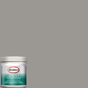
Cement Gray
Nimbus Cloud

Mourning Dove
I'm leaning toward Mourning Dove for it's more brown undertone. I'd like to keep it from looking too blue. So drop me a note, and by all means, if you have a favorite gray, let me know!

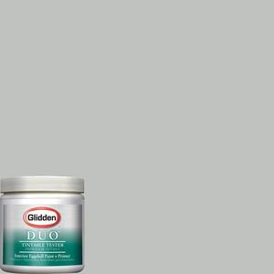
Sherwin Williams #7031 Mega Greige
This color, SW7031 Mega Greige came from long-time reader and friend Brenda, or mrsben. We go way back to my RMS days, and she's been a real pal. I love this suggestion to, so ... keep them coming!
I've broken this post into several parts, to give me some time to finish the project: so, stay tuned for Part Two where we'll be shopping for the materials.
Me too on the mourning dove
ReplyDeleteI do love the Morning Dove and I am so excited to see your progress, Artie. Your posts and projects make my days so much better!
ReplyDeletexoxo
Karena
Art by Karena
Recall the beautiful job you did on upgrading your bookcases so know your bed will be amazing. Re paint colour; you may wish to have a peek at Sherwin Williams #7031 Mega Greige which is a warm neutral (with no blue undertone).
ReplyDeleteLooking forward to your next post. Hugs -Brenda-
Footnote: Another suggestion ... if you have a sample of your fabric take it to a paint dealer and have it colour matched then tweak it to your desired colour using its formula of colorants.
Be sure you take notes, as the result will be a custom colour. As a sewer with fabric swatch in hand and 'a former wallpaper junkie' ☺ I often use(d) this method when in doubt. (I'm also notorius when it comes to cutting the formula (25% to 50%).)
I love that you are making your own.. It is certainly a doable project and will be exactly what you like. Mega Greige is a bit pinkish.. so I'd probably pick Mourning Dove. But wait, I'd consult with my linen to see which it liked better! Good luck. I know it will be beautiful.
ReplyDeleteIf anyone can pull it off, it is you Artie!
ReplyDeleteMourning Dove is lovely, but it depends on how it looks with the linen, of course. I just painted my guest bath in Ben Moore's Revere Pewter (HC 172) and I love it...a gray with brown undertones. For a little deeper tone, take a look at Farrow and Ball's Elephant's Breath. I used it in my kitchen/family room and it is a very interesting gray. Whatever your decision, I am sure it will look fabulous.
ReplyDeleteBest...Victoria
This is exciting! I might like to make one this summer.
ReplyDeleteKaren
شركة نقل عفش بالقصيم
ReplyDeleteشركة نقل عفش بينبع
شركة نقل عفش بنجران
شركة نقل عفش بحائل
شركة نقل عفش ببريدة
شركة نقل عفش بتبوك
شركة نقل عفش بالظهران
شركة نقل عفش برابغ
<